In Asia the decline was even steeper: from about 159 deaths per 1,000 to only 31 deaths per 1,000 live births.
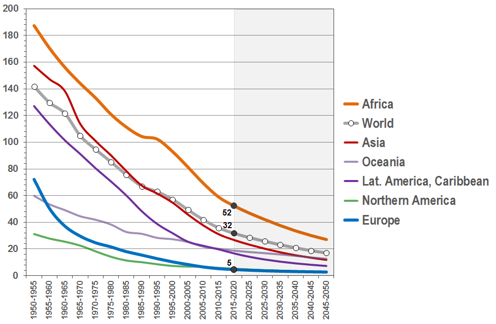
In Europe, the infant mortaliity was relatively high, shortly after World War II - around 72 deaths per 1,000 births. This was about double the level as in Northern America, where the infant mortality was only 31 in the early 1950s. However, since then, infant mortality in Europe declined to 5 deaths per 1,000 births in 2010/15 - slightly lower than even in Northern America where it was 6 per 1,000.
In Africa, where the initial level of infant mortality in the early 1950s was in the range of 187 deaths per 1,000 births it declined significantly to about 59 deaths per 1,000 live births in 2010/15. However, this level is still about ten times higher than in Europe.
In Asia the decline was from about 238 deaths per 1,000 to only 39 deaths under age five per 1,000 live births in 2010/15.
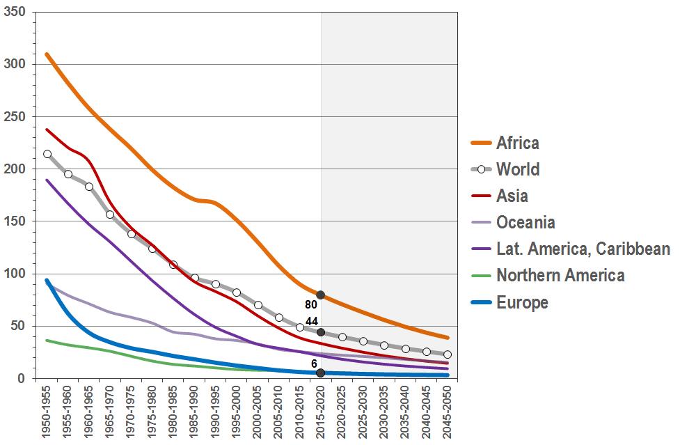
In Europe, the under-five mortality declined from around 94 in the early 1950s to 6 deaths per 1,000 births.
In Africa, the initial level of the under-five mortality in the early 1950s was in the range of 310 deaths per 1,000 births. In other words: More than 3 out of 10 children died before their fifth birthday. The under-five mortality has now declined significantly to about 90 deaths per 1,000 live births in 2010/15. However, this level is still about ten times higher than in Europe or Northern America.
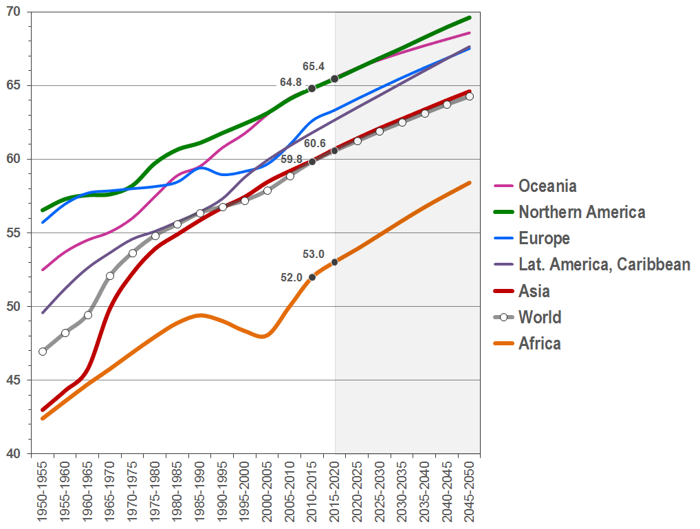
Today, life expectancy at birth is at abount 65 years in Northern America, but only 52.5 years in Africa. The world average in life expectancy at birth is currently at about 60 years.
The most spectacular decline of (infant and child) mortality was estimated for Asia, where the life expectancy at birth, as a consequence, increased from about 43 years in the early 1950s to almost 60 years in the 2010-2015 period.
Please also note the temporary increase in AIDS-related mortality in Africa, which lead to a significant decline in the life-expectancy at birth peaking in the period 2000-2005. Average life expectancy in Africa is still lower today, than it would have been without the HIV/AIDS epidemic.
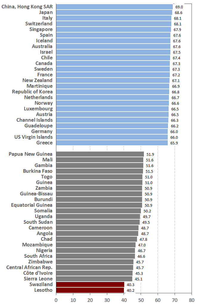
Hong Kong, Japan and Italy were estimated to have the highest average life expectany at birth of between 68 and 69 years in the period 2010 to 2015.
The lowest life expectancy at birth in 2010 to 2015 was estimated for Lesotho and Swaziland (a little more than 40 years) and for Sierra Leone (about 45 years). These countries are still seriously affected by the HIV-AIDS epidemic.
With only one exception (Papua New Guinea) the 25 countries with the lowest life expectancy at birth in the period 2010 to 2015 are located in Africa.
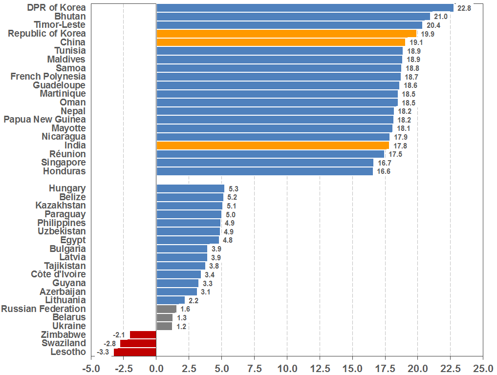
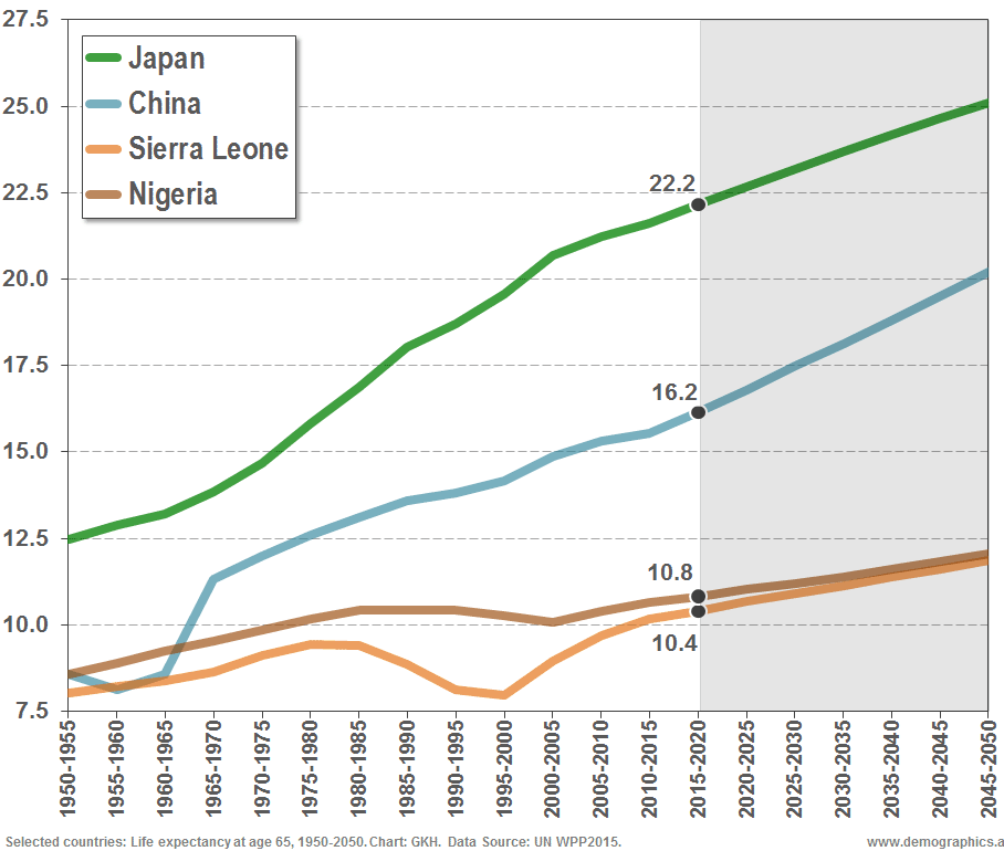
Three Asian countries should be pointed out in particular: The Republic of Korea, China and India. All three had a spectacular increase in average life expectancy between the early 1950s and today. South Korea's average life expectancy increased by almost 20 years; China's by more than 19 years and India's by almost 18 years.
Especially for the populous countries of India and China this decline in mortatlity is remarkable. It is mainly the result of a drastic reduction of infant and child mortality
As a consequence of the HIV/AIDS epidemic and an overall delay in development many countries in Africa had only a little decline in mortality as compared to the early 1950s. For Zimbabwe, Swaziland and Lesotho the United Nations estimated that the life expectancy had even declined and is 2 to more than 3 years lower today than in the early 1950s.
Quite remarkable is also the little increase of life expectancy in the Ukraine, Belarus and the Russian Federation. It is estimated that the average life expectancy of these populations is just 1.2 to 1.6 higher today than in the early 1950s.
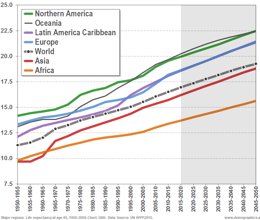
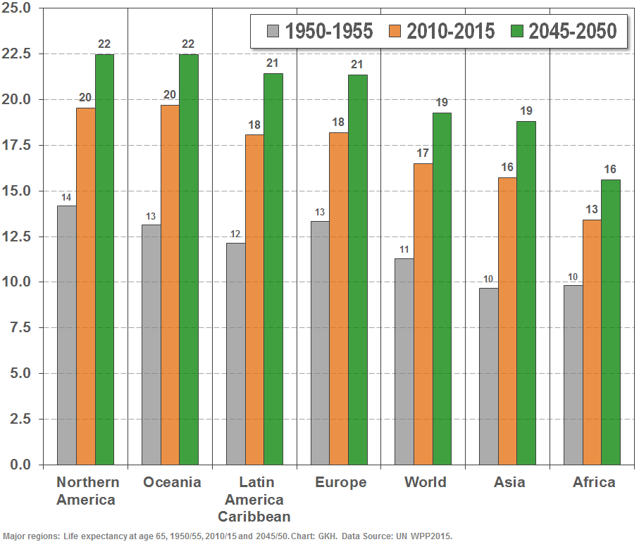
On average, life expectancy at age 65 is projected to rise from 11.3 years in the early 1950 to 19.3 years in 2050.
In Asia, life expectancy at age 65 will almost double from 9.7 years in 1950/55 to 18.8 years in 2050 - thanks to countries such as Korea and China, where the decline of mortality was really spectacular.